Tests
Tests
Tests
Problem 1

The self-changing horizontal screen animation doesn’t show all the details of the verification process in the hero section—users in the example above see only one screen and click to start onboarding. Key verification info must be visible in the hero section to avoid user confusion.
Solution

After the update, this screen shows three illustrations with key verification info at first glance, giving users clear and honest information. The hero section now works as intended.
Problem 1
The self-changing horizontal screen animation doesn’t show all the details of the verification process in the hero section—users in the example above see only one screen and click to start onboarding. Key verification info must be visible in the hero section to avoid user confusion.
Solution
After the update, this screen shows three illustrations with key verification info at first glance, giving users clear and honest information. The hero section now works as intended.
Problem 1
The self-changing horizontal screen animation doesn’t show all the details of the verification process in the hero section—users in the example above see only one screen and click to start onboarding. Key verification info must be visible in the hero section to avoid user confusion.
Solution
After the update, this screen shows three illustrations with key verification info at first glance, giving users clear and honest information. The hero section now works as intended.
Problem 2

In the navigation, the user moves from sign-up to a tool-related subpage before reaching the support page. Since support information is more important from a business perspective, users should be able to access the support subpage more quickly.
Solution

After the update, the support subpage appears in the navigation immediately after sign-in.
Problem 2
In the navigation, the user moves from sign-up to a tool-related subpage before reaching the support page. Since support information is more important from a business perspective, users should be able to access the support subpage more quickly.
Solution
After the update, the support subpage appears in the navigation immediately after sign-in.
Problem 2
In the navigation, the user moves from sign-up to a tool-related subpage before reaching the support page. Since support information is more important from a business perspective, users should be able to access the support subpage more quickly.
Solution
After the update, the support subpage appears in the navigation immediately after sign-in.
Problem 3

Users skip the "Decide Who is Real" section—which displays a verification screen with candidate details—and instead focus on options to delete or question the candidate. This behavior suggests that users value control and interactive options over simply viewing verification details.
Solution

After the update, I switched the order of the "Decide Who is Real" and "No Answer: Delete or Ask Again" sections. Currently, the "No Answer: Delete or Ask Again" section appears directly after the hero section.
Problem 4

The user scrolls past the pricing section without stopping, which is problematic since pricing is important and should capture the user's attention.
Solution

After the update, the pricing section has a different background color to make it stand out and catch the user's attention.
Problem 5

The user first chooses the free demo, then considers other options. It’s important to make the paid Pro version more appealing and encourage users to focus on it.
Solution
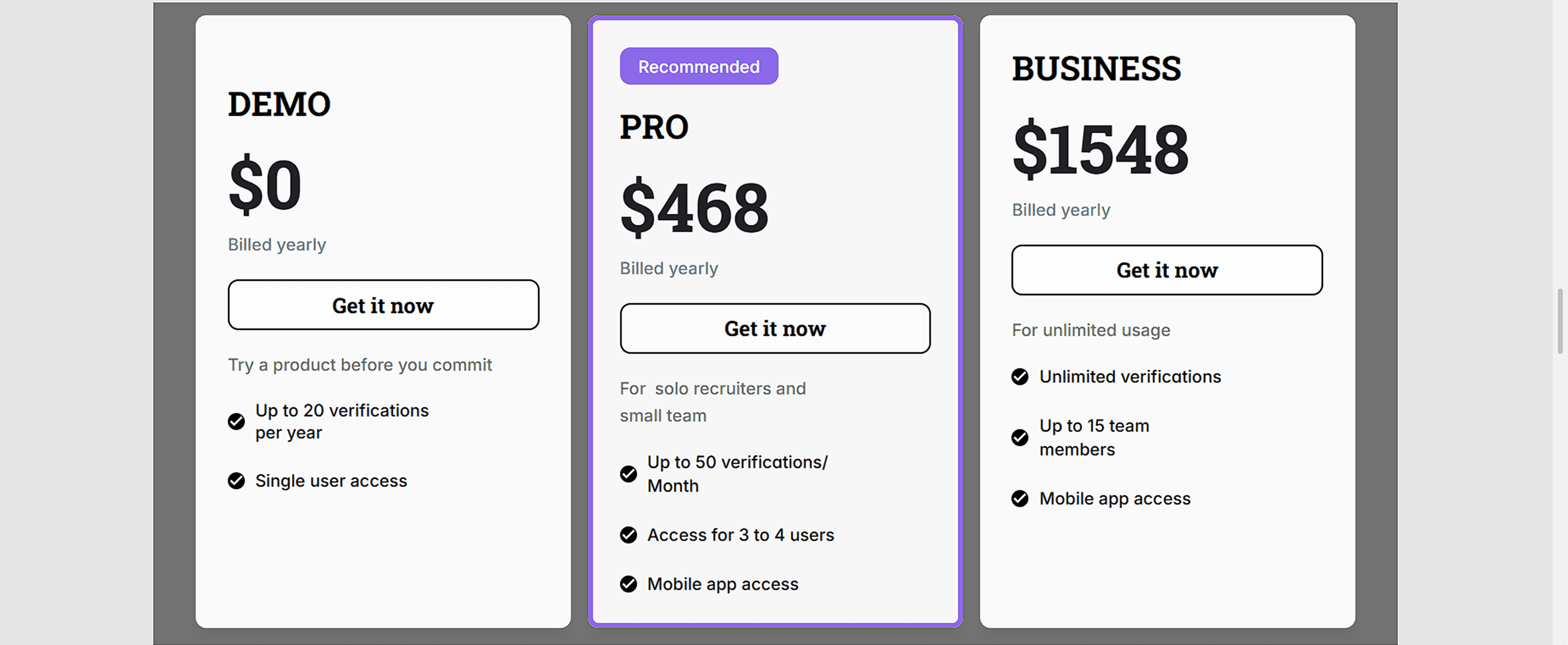
After the update, the Pro version stands out more and catches the user's eye
Problem 3
Users skip the "Decide Who is Real" section—which displays a verification screen with candidate details—and instead focus on options to delete or question the candidate. This behavior suggests that users value control and interactive options over simply viewing verification details.
Solution
After the update, I switched the order of the "Decide Who is Real" and "No Answer: Delete or Ask Again" sections. Currently, the "No Answer: Delete or Ask Again" section appears directly after the hero section.
Problem 3
Users skip the "Decide Who is Real" section—which displays a verification screen with candidate details—and instead focus on options to delete or question the candidate. This behavior suggests that users value control and interactive options over simply viewing verification details.
Solution
After the update, I switched the order of the "Decide Who is Real" and "No Answer: Delete or Ask Again" sections. Currently, the "No Answer: Delete or Ask Again" section appears directly after the hero section.
Problem 3
Users skip the "Decide Who is Real" section—which displays a verification screen with candidate details—and instead focus on options to delete or question the candidate. This behavior suggests that users value control and interactive options over simply viewing verification details.
Solution
After the update, I switched the order of the "Decide Who is Real" and "No Answer: Delete or Ask Again" sections. Currently, the "No Answer: Delete or Ask Again" section appears directly after the hero section.
Problem 4
The user scrolls past the pricing section without stopping, which is problematic since pricing is important and should capture the user's attention.
Solution
After the update, the pricing section has a different background color to make it stand out and catch the user's attention.
Problem 4
The user scrolls past the pricing section without stopping, which is problematic since pricing is important and should capture the user's attention.
Solution
After the update, the pricing section has a different background color to make it stand out and catch the user's attention.
Problem 4
The user scrolls past the pricing section without stopping, which is problematic since pricing is important and should capture the user's attention.
Solution
After the update, the pricing section has a different background color to make it stand out and catch the user's attention.
Problem 5
The user first chooses the free demo, then considers other options. It’s important to make the paid Pro version more appealing and encourage users to focus on it.
Solution
After the update, the Pro version stands out more and catches the user's eye
Problem 5
The user first chooses the free demo, then considers other options. It’s important to make the paid Pro version more appealing and encourage users to focus on it.
Solution
After the update, the Pro version stands out more and catches the user's eye
Problem 5
The user first chooses the free demo, then considers other options. It’s important to make the paid Pro version more appealing and encourage users to focus on it.
Solution
After the update, the Pro version stands out more and catches the user's eye
What we correct in iteration?
What we correct in iteration?
What we correct in
iteration?
After the update, the hero section immediately displays
three illustrations with key verification information, giving users clear and transparent details right away. The support subpage now appears in the navigation right after signing in. The order of the “Decide Who is Real” and “No Answer: Delete or Ask Again” sections has been changed. The pricing section features a different background color to make it more noticeable and to catch users’ attention. The Pro offer is now more prominent and attracts users’ attention more effectively.
After the update, the hero section immediately displays
three illustrations with key verification information, giving users clear and transparent details right away. The support subpage now appears in the navigation right after signing in. The order of the “Decide Who is Real” and “No Answer: Delete or Ask Again” sections has been changed. The pricing section features a different background color to make it more noticeable and to catch users’ attention. The Pro offer is now more prominent and attracts users’ attention more effectively.
After the update, the hero section immediately displays three illustrations with key verification information, giving users clear and transparent details right away. The support subpage now appears in the navigation right after signing in. The order of the “Decide Who is Real” and “No Answer: Delete or Ask Again” sections has been changed. The pricing section features a different background color to make it more noticeable and to catch users’ attention. The Pro offer is now more prominent and attracts users’ attention more effectively.